Top Five reasons I use Dolphin as my file manager
Linux has a lot of choices for everything. I’m a big fan of choice. For almost every open source application or tool, there are an astounding number of choices. File managers are no exceptions
In a recent article, TECHMINT blog lists the 32 Best File Managers and Explorers [GUI + CLI] for Linux in 2024. That’s a lot of file managers and the author even says that these are, “…some of the best…,” so surely there’s one — or more — there to meet your needs. There’s no stated order to the list, but they appear to be listed with the more common at the top and the less common ones nearer the bottom. I’ve used, or at least tried, most of these at one time or another and they all have some excellent features.
But Dolphin is my — current — favorite. It’s the default file manager for the KDE Plasma desktop. Dolphin is mischaracterized in that TECHMINT list as they call it simple. It is simple to use for new users, but it’s anything but simple if you explore its depths.
1. It’s Simple
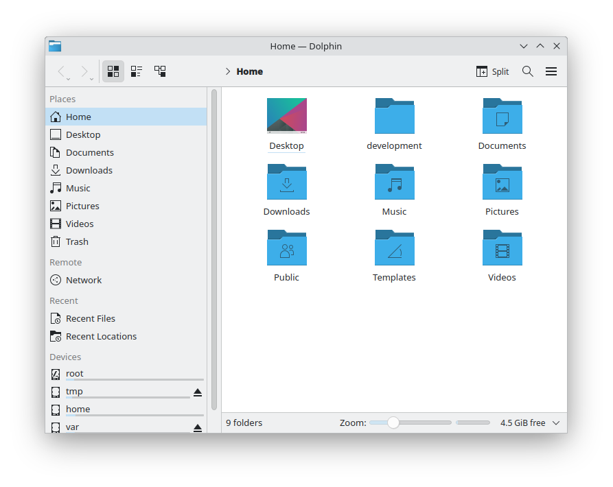
Dolphin is the default file manager for the KDE Plasma desktop, but it can be installed and used on any desktop. Figure 1 shows an instance Dolphin on a new installation of Fedora with KDE Plasma 6.1.
The sidebar currently shows a list of places, such as your home directory and other subdirectories. It also lists Recent File and Recent Locations, as well as a list of all connected devices with a bar graph that indicates the relative amount of space used on each. The right pane shows the contents of the selected place or directory using the Icon view mode.
This is a simple initial state that is easy for a new Linux user to understand and use. Many users may never need any more from a file manager than this and many others may not know that it has so many capabilities that aren’t even hinted at with a simple view like that in Figure 1.
2. It’s Complex
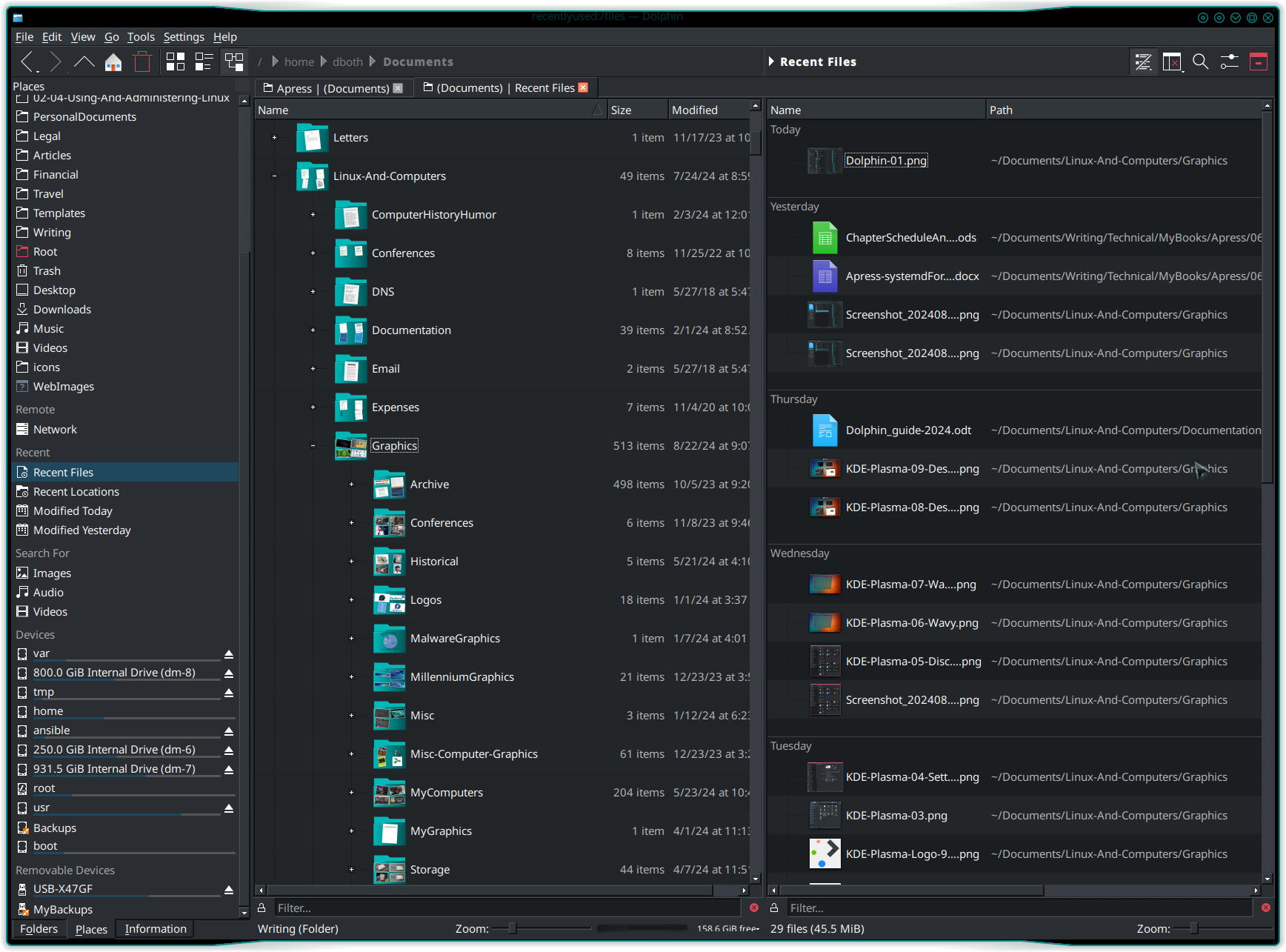
Figure 2 shows Dolphin configured for my aesthetic and functional preferences.
The right panel is split into two, so it can display two different locations. In this case the left panel displays the contents of my Documents directory in the Details view. I opened the Graphics subdirectory into a tree view with the plus ( + ) icon on its left. That icon now shows as a negative ( – ) and clicking on that will close the displayed directory tree.
The right panel displays the Recent Files list which is subdivided into recent days. If you’ve been using Dolphin long enough, it also has an Earlier section containing increasingly large time intervals such as months and years. You can see some of the recent files I’ve been working on for the last few days.
You could also select Recent Locations to view a list of directories you’ve recently perused.
Each panel can show the same or different locations, devices, and network locations, if you’re on a network that has accessible remote file sharing.
3. Tabs
I like tabs. I like tabs on my terminal emulator, Konsole, and I like tabs on my file manager, no matter which one it is. You can see that I have two tabs open in Figure 2. Each tab shows the names of the locations it contains. If the pane in a tab is split into two panels, it contains the names of both locations separated by the vertical bar ( | ). The active panel is indicated by being in parentheses.
Tabs add a layer of functionality that allows me to use only a single instance of Dolphin, thus reducing window congestion on my desktop.
In Dolphin, each tab contains one panel which can be split into two.
4. Extensive help
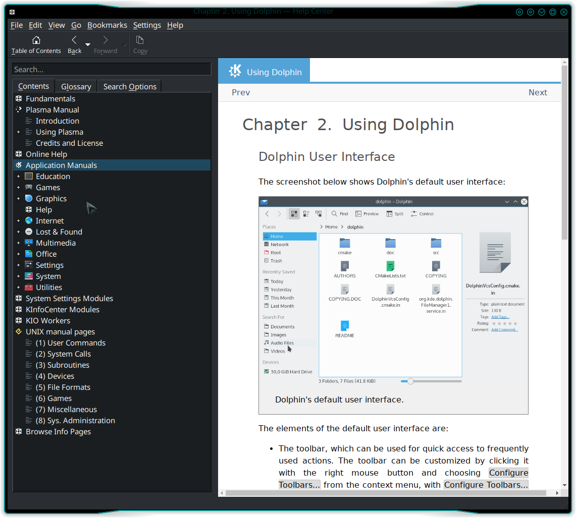
Dolphin has an excellent on-line, Help facility. Press F1 when Dolphin has focus, or click on the Help item on the Dolphin Menu Bar. Either method opens a very nice and complete User’s Guide for Dolphin. The Guide starts with an introduction to Dolphin, and its user interface. It then goes on to cover the more advanced features.

Although it opens directly to Dolphin, this help facility contains guides for KDE and all KDE programs and tools. It then covers more in-depth details of using Dolphin and how to configure it.
The Dolphin documentation also describes its relationship to Konqueror. Konqueror is more than a file manager; it’s intended to be a universal viewer, including file management, web browsing, and more. Dolphin is intended to only be a powerful file manager with its interface optimized for that task.
5. Flexibility
Flexibility is one of the key attributes I look for and appreciate in the open source tools I choose. The Dolphin file manager is an exemplar for flexibility.
Dolphin is, without any configuration changes one of the most functional file managers I’ve ever used. Despite the fact that many of its features are hidden from direct view, they can be accesses using the Menu Bar. They can be added to the icon bar which makes those features visible. I typically add those icons for the features I use most frequently.
This flexibility makes Dolphin easy to reconfigure to meet your own needs and the way you work. It can also suggest new ways to work that can be more productive. I have found some new ways of working and managing files and access to files and directories.
More
Dolphin has many tools and features that couldn’t be covered no matter how many list items are allowed. One of the features I like most that didn’t make the top five, are the tabs at the bottom of the left sidebar in Figure 2. This allows me to choose to see the Places view. I can drag folders there and use them as bookmarks to navigate to them quickly. The Folders tab shows a three view of the directory structure, and the Information view displays detailed information about the selected file or directory.
Dolphin is well integrated into the KDE Plasma desktop and user interface. It can also be installed on any desktop and work well. I use it when in Xfce, my other favorite desktop.

